Blockhead Bob's GIS Projects
I have been involved in various aspects of the Geographic Information Systems (GIS) field for over 20 years. I currently specialize in GIS database administration, administering an enterprise GIS database with over 120 users and several terabytes of data. I am particularly interested in automating data administration tasks using Python, including new workflows incorporating data hosted in the ArcGIS Online cloud based system. I am also very interested in web map application development to make GIS data available to end users in easy to use interfaces and have developed several internal web mapping applications.
2020 - 2022 Covid-19 U.S. New Cases Time Series Map
2020 - 2022 Covid-19 Colorado New Cases Time Series Map
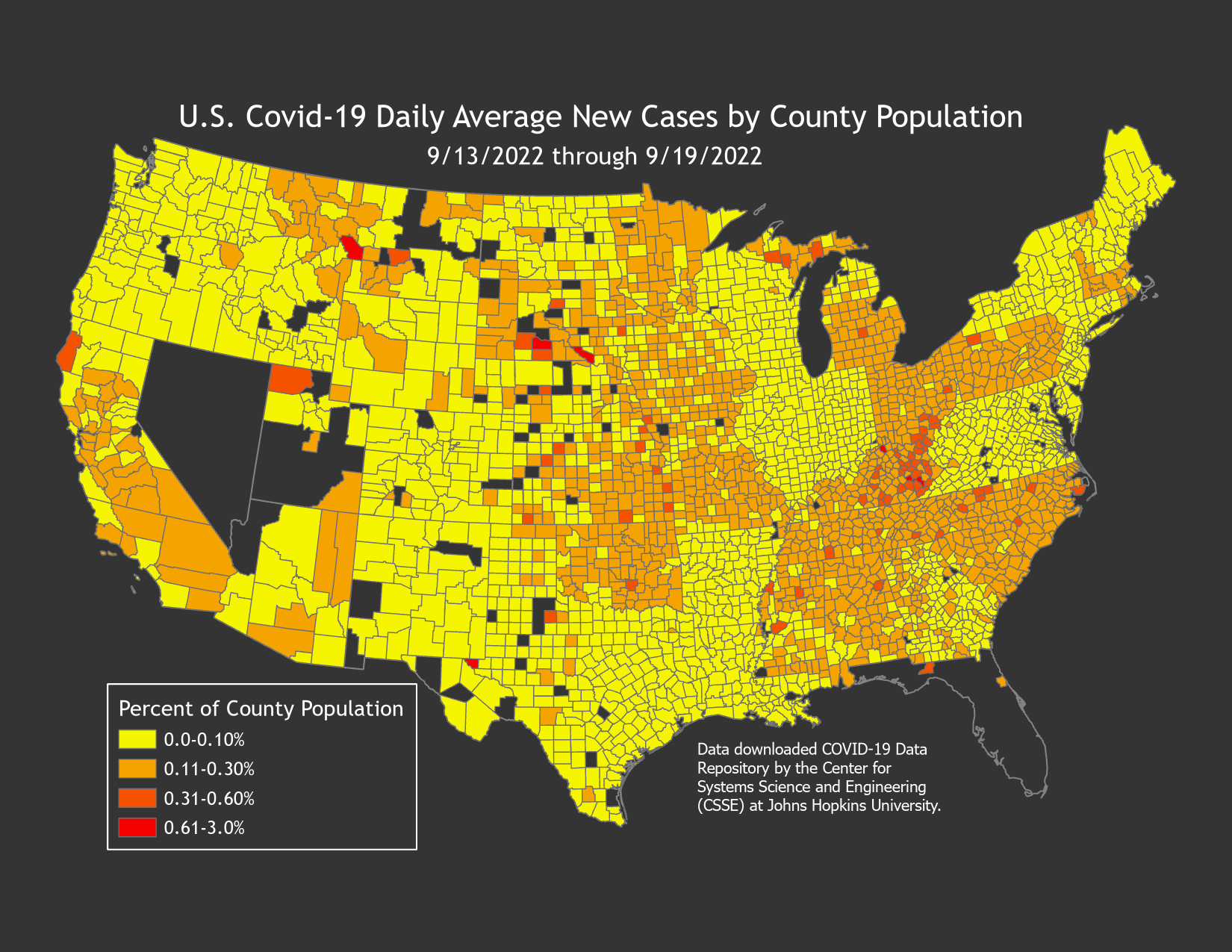
2022 U.S. Covid Map - Average of 7 Day Daily Cases As A Percentage of County Population
2022 U.S. Covid Map - Average of 7 Day Daily County Cases
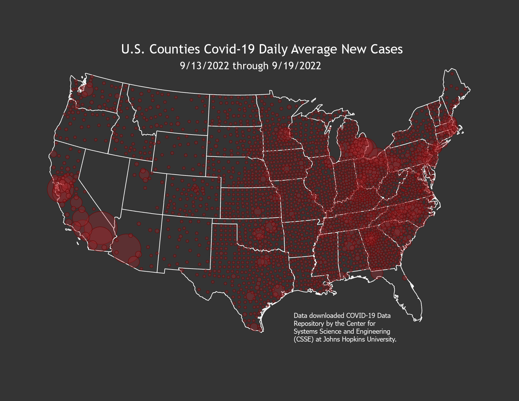
With Covid-19 consuming most of our lives in 2020 and having extra time at home, I decided to have a go at developing a daily time series map of new cases for the continental U.S. and Colorado. This effort consisted of downloading the data available from COVID-19 Data Repository by the Center for Systems Science and Engineering (CSSE) at Johns Hopkins University and developing Python scripts to convert these data from their original csv format to GIS, joining them to their associated county boundary data, and converting cumulative new case numbers to a daily new case number for each U.S. county reporting new cases.
Once the data were in a GIS county boundary format with a daily date and associated new case number, I used ArcGIS Pro to symbolize the data in a dot density format by county with each dot representing 10 new reported cases. These data were formatted as a time series and ArcGIS Pro Animation tools were used to create the mp4 of the number of new cases displaying for each day on a national (continental U.S.) and Colorado county map.
While I have not built the scripting out to make these data available in real time, the Python scripts developed automate updates to the map, which I am planning on updating weekly until, hopefully shortly, the dots blink out all together.
This was a great project to work on to further develop Python scripts to automate data manipulation tasks, as well as learn about some of the very powerful new tools in ESRI's ArcGIS Pro software, especially the improvements in working with time series data and animation.
My deepest sympathies to all those affected by this terrible disease.
2019 ESRI User Conference Map Gallery Presentation
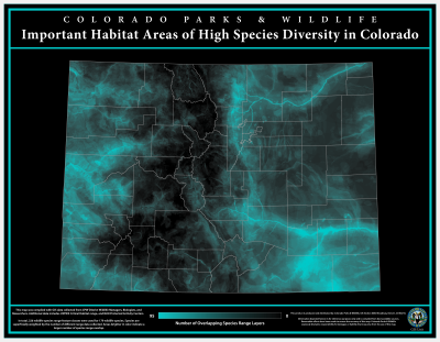
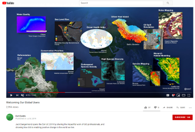
In 2019, I had the opportunity to participate in my 3rd ESRI User Conference and decided that it was well past time to present some of my work in the map gallery. A couple of things I had been working on seemed to merge perfectly for something to present. First, I had been working on migrating Python scripts from the old ArcMap 32-bit Python 2.7 processing to the new ArcGIS Pro 64-bit Python 3.x platform. Second, I had been looking at overlaying various wildlife species seasonal activity layers that Colorado Parks & Wildlife collects from District Wildlife Managers and Biologists. Combining these two aspects of my work, I wrote a Python script to iterate over the seasonal activity layers and convert them to raster layers and then create a weighted overlay showing the number of overlap at a 300 meter grid cell across the state of Colorado. This was a great experience and I was happy to be able to contribute something to the ESRI User Conference map gallery and was elated upon seeing the map selected for inclusion in CEO Jack Dangermond's plenary slide presentation.
This map has also been published to Esri's online map gallery:
In 2020, this map was selected for publication in the Esri Map Book published by Esri Press.
- Sacco, Robert. Important Habitat Areas of High Species Diversity in Colorado. Esri Map Book, Volume 35 (ISBN 13: 978-1589485860; ISBN 10: 1589485866), edited by Esri, Esri Press, 2020.
ArcGIS Pro Not-So-Historic Dory Lakes Map
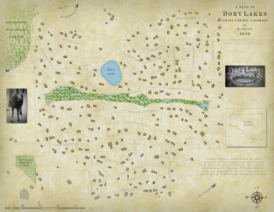
With the ESRI push toward moving away from the ArcMap software to the new ArcGIS Pro, I figured I better get up to speed at some point. After coming across a blog by John Nelson featuring a historic looking community map of Waterloo, Ontario, I decided to try my hand in learning the new software by applying some of the techniques available in ArcGIS Pro as developed and described by cartographer Warren Davison in Not-So-Historic Survey Plan Blog. Having an affinity for old maps I enjoyed trying to develop a similar map for my neighborhood using ArcGIS Pro.
ArcGIS Pro Ghost Town Disc Golf Course Map
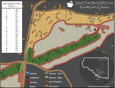
This is a map of the local disc golf course I play on occasion. Just another fun map I worked on in my spare time to get comfortable using ArcGIS Pro software.
Colorado Lynx Travel Animated Time Series Map
An animated map displaying the travel routes of 8 Canada Lynx reintroduced to Colorado and which made long distance exploratory journeys. Developed to support Colorado Parks & Wildlife podcast on lynx reintroduction to the state.
Individual Colorado Lynx Travel Animated Time Series Map
An animated map displaying the travel route of a Canada Lynx reintroduced to Colorado and which made a long distance exploratory journey. Developed to support Colorado Parks & Wildlife podcast on lynx reintroduction to the state. This map displays the journey of an individual lynx.
Colorado Moose Overall Range Animated Time Series Map
An animated map displaying the expansion of moose overall range in Colorado created to support Colorado Parks & Wildlife podcast on moose in the state.